本文最后由 Demo Marco 更新于 2023-06-11. 如有资源已失效,请留言反馈,将会及时处理。 【推荐:不翻墙访问被墙网站方法 | 自用高速专线机场 | 高速CN2线路 | 高质量家宽住宅IP】
Author: Gergely Vilaghy
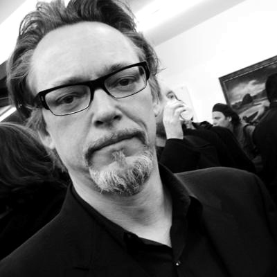
史蒂文·吉尔摩 (Steven R. Gilmore) 是一位才华横溢的设计师,他被预告片音乐迷们称为“地狱两步”的惊人封面艺术的创造者。
欲了解更多信息,请查看他的 网页。
Trailer Music News:我们真的被你为 Two Steps From Hell 专辑创作的封面艺术所吸引。当然,这只是你作为设计师的一个方面,正如我们在你的网站上看到的那样,你参与了非常知名品牌(可口可乐、米拉麦克斯、二十世纪福克斯等)的形象塑造。其中哪一个是最令人难忘的?
Steven R. Gilmore:如果非要让我选择的话,最令人难忘的是我为《指环王》的两部电影配乐所做的工作。与其说是因为我为我所做的工作(我是)感到自豪,还不如说是因为我不得不为这两个版本投入大量的时间。有许多必须创建的特别版包以及许多全球定期发行和广告。归根结底,这两个合并版本花费了大约 10 个月的扎实工作,但我却老了大约十年。话虽如此,我通常最热衷的是我目前正在从事的项目. 尝试新事物并从错误中吸取教训的过程让我真正感到兴奋。
TMN:你是怎么参与到地狱两步的?
SRG:我最初是通过 Nick Phoenix 接触到 TSFH 的。十多年来,我们与 East West Sounds 的道格·罗杰斯 (Doug Rogers) 一起为他的 Quantum Leap 项目进行了合作。
TMN:你是如何设计这个音乐库的视觉形象的?
SRG:当我第一次开始研究 TSFH 时,我不知道他们最终会发布这么多版本,或者它本身会演变成一种身份。我的方法与我处理任何单个项目的方法相同,我的灵感来自于 TSFH 的名称和任何建议。
TMN:设计这家公司的封面艺术背后的概念是什么?
SRG:每次发行都会有所不同,因为主题总是不同,但我确实记住,这种音乐主要用于预告片,所以我对图形采取了更多的电影方法,而不是音乐方法。
TMN:有很多制作曲库;你如何看待与他们相关的图像?图像创作中最重要的部分是什么?你如何使 《地狱两步》脱颖而出?
SRG:我没有看到任何其他制作音乐库,所以我不能对它们发表评论。
与 TSFH 合作的好处在于,在大多数情况下,他们让我自由支配,去做我认为最适合项目的事情(当然,除非他们有特定的想法)。
一般来说,我很重视客户的意见,但尽可能少的意见也是我创作过程的重要组成部分,这样我就可以尽情发挥我的想象力。当我有太多的信息或相互矛盾的反馈时,我开始重新猜测自己,工作变得同质化,这从来都不是一件好事。我更喜欢使用一些关键的描述性词语,比如动态、预感、浪漫、令人振奋或类似的词语自然。然后我开始在大脑中寻找符合这些描述的想法。我通常从一个明显的想法开始,然后慢慢将其抽象到我满意的程度。例如Illumina我最初的想法围绕着中世纪和彩色玻璃,你仍然可以在背景中看到一丝幽灵般的感觉。但后来我的思绪开始飘忽不定,这让我想到了一般的光,尤其是在拥有霓虹灯和超大 LED 屏幕的东京。但是东京的灯光对于我想要描绘的空气来说太刺眼了,所以我开始考虑日本花园。最终我得到了你所看到的,一个日本女人漂浮在花朵和云朵轻盈的氛围中,带有一丝中世纪的气息。
我并没有刻意让 TSFH“脱颖而出”,我只是尽力做到最好。
TMN:创建品牌标识背后的过程是什么?你的方法是什么?
SRG:正如我之前提到的,我并没有开始将 TSFH 视为品牌标识,否则我可能会采取不同的方法。但现在他们已经发布了多个版本,并受到业内如此多的人的尊敬,这已经变成了一种身份。我很高兴知道也许我的包装一路帮助了他们。
TMN:一个哲学问题:品牌的边界在哪里?现在什么都跟品牌挂钩,好像连人都可以把自己当作品牌来推销。
SRG:我认为品牌没有任何界限。有些人天生就想脱颖而出,如果这是他们的目标,他们会以任何可能的方式做到这一点。无论是微妙还是大爆炸。
TMN:你对《Two Steps From Hell》的音乐有什么看法?你喜欢预告片音乐吗?
SRG:我不经常听到 TSFH 的音乐,但我听到的那一点却给我留下了深刻的印象。这提醒了我,我必须让他们给我发一些最近发布的(眨眼)。在开始设计封套之前,我通常不会听音乐,Nick 和 Thomas 会交流他们对音乐的想法和描述,我通常会从那里开始。当然,谁不喜欢预告片音乐?它定下了基调,让你对电影或产品感到兴奋。
TMN:你对未来有什么计划?
SRG:终于让我的新网站上线了!开个玩笑,现在我有太多选择,我无法肯定地回答这个问题。目前,我正在专注于我的绘画(多年来一直被遗憾地忽视了),同时仍在从事一些商业项目。在我的网站上有一个指向我个人作品的 PDF 链接以及我的商业作品。
TMN:我知道这是一个有点像设计师极客的问题:你最喜欢的字体是什么?我个人非常喜欢 Trajan,它被用作 Two Steps From Hell 的标志。
SRG: 我真的没有最喜欢的字体。我要么从头开始设计标题,要么使用我认为适合手头工作的字体风格。但有一些字体我会反复使用,它们是 Trade Gothic、Bell Gothic 和 DIN(FontShop 版本),但这些主要用于正文。听起来很无聊,这些天我真的很喜欢 Helvetica 和 Times New Roman。也许是因为他们没有发表声明,让我可以更专注于纯粹的视觉图像,而不是排版方面。
Steven R. Gilmore is a talented designer who is known to trailer music fans as the creator of the amazing cover arts of Two Steps From Hell.
For more information check his webpage.
Trailer Music News: We were really taken by the cover art you have created for the Two Steps From Hell albums. Of course this is only one aspect of your output as a designer, as we can see on your website you have participated in constituting the image of very recognizable brands (Coca-cola, Miramax, Twenty Century Fox, etc). Which one of these was the most memorable?
Steven R. Gilmore: If I had to choose, the most memorable was the work I did on the two movie soundtracks for the The Lord Of The Rings. Not so much because I am proud of the work I did (which I am) but more for the incredible amount of hours I had to put into those two releases. There were a number of special edition packages that had to be created as well as numerous worldwide regular releases and advertising. At the end of the day, the two combined releases took about 10 months of solid work but aged me about ten years.With that being said, what I’m usually most enthusiastic about is the project that I’m working on in the moment. The process of trying new things and learning from my mistakes is something I truly get excited about.
TMN: How did you get involved with Two Steps From Hell?
SRG: I originally got involved with TSFH through Nick Phoenix. We have worked together on his Quantum Leap projects with Doug Rogers at East West Sounds for over a decade now.
TMN: How did you approach creating the visual identity of this music library?
SRG: When I first started working on TSFH I didn’t know that they were going to end up having so many releases or that it would evolve into an identity per se. My approach was the same as I would approach any single project, I was inspired by the name and any suggestions that TSFH may have had.
TMN: What was the concept behind designing the cover art of this company?
SRG: It varies for each release as the themes are always different but I do keep in mind that this music is mainly going to be used for trailers so I take more of a cinematic approach to the graphics as opposed to a musical one.
TMN: There are many production music libraries; what do you think about the images associated with them? What is the most important part of the image-creation, and how do you make Two Steps From Hell stand out?
SRG: I haven’t seen any other production music libraries so I can’t comment on those.
What is great about working with TSFH is that for the most part they give me free reign to do what I think is best for the project (unless of course they have a specific idea in mind).
Generally speaking I value input from my clients, but it is also an important part of my creative process to have as little input as possible so I can let my imagination roam. When I have too much information or conflicting feedback I start second guessing myself and the work becomes homogenized, which is never a good thing.I prefer to work with a few key descriptive words such as dynamic, foreboding, romantic, uplifting or words of that nature. Then I start scouring my brain for ideas that fit those descriptions. I usually start with an obvious idea then I slowly abstract it to a point where I’m happy with it. For instance with Illumina my original ideas revolved around the middle ages and stained glass, which you can still see a hint of with the ghosted type in the background. But then my mind starting wandering which got me thinking about light in general, particularly in Tokyo with all the neon and super sized LED screens. But the lights of Tokyo were too garish for the airiness I wanted to portray so I started thinking about Japanese gardens. Eventually I ended up with what you see, a Japanese woman floating in a light luminous atmosphere of flowers and clouds with a hint of the middle ages.
I don’t consciously set out to make TSFH “stand out”, I just try and do the best job that I possibly can.
TMN: What is the process behind creating a brand identity? What is your method?
SRG: As I mentioned before I didn’t start out thinking of TSFH as a brand identity or perhaps I would have taken a different approach. But now that they have several releases under their belt and are revered by so many people in the industry it has turned into an identity. I’m just happy knowing that perhaps my packaging has helped them along the way.
TMN: One philosophical question: Where are the borders of branding? Nowadays everything is connected to a brand, and it seems like even a person can sell himself as a brand.
SRG: I don’t believe there are any borders in regards to branding. Some people inherently want to stand out and they are going to do it in any way that they possibly can if that is their goal. Whether it is with subtlety or a big bang.
TMN: What is your opinion of Two Steps From Hell’s music? Do you like trailer music?
SRG: I don’t get to hear the music of TSFH very often but the little I have heard is very impressive. That reminds me, I have to ask them to send me some of the recent releases (wink). I don’t normally hear the music before I start designing the sleeve, Nick and Thomas communicate their ideas and descriptions of the music and I usually take it from there.Of course, who doesn’t like trailer music? It sets the tone and gets you excited about a movie or product.
TMN: What are your plans for the future?
SRG: To finally get my new website up! Kidding aside, there are so many choices for me right now that I can’t answer that question with any kind of certainty. For the time being I’m concentrating on my paintings (which has been sadly neglected over the years) while still working on a few commercial projects. There is a link to a PDF of my personal work on my website along with my commercial work.
TMN: I know it’s a bit of a designer-geek question: what is your favorite font? I personally really like Trajan, which is used as Two Steps From Hell’s logo.
SRG: I don’t really have a favorite font. I either design a title from scratch or use a type style that I think is appropriate for the job at hand. But there are fonts that I come back to time and again, which are, Trade Gothic, Bell Gothic and DIN (FontShop version) but these are mainly for body copy. And as boring as this may sound, I’ve been really getting into Helvetica and Times New Roman these days. Perhaps because they don’t make a statement which leaves me open to concentrate more on pure visual imagery and not so much on the typography side of things.


